
CATEGORY: COMPLIANCE, EDUCATION
TITLE: DOSE OF REALITY FOR EMPLOYERS
PROJECT BACKGROUND
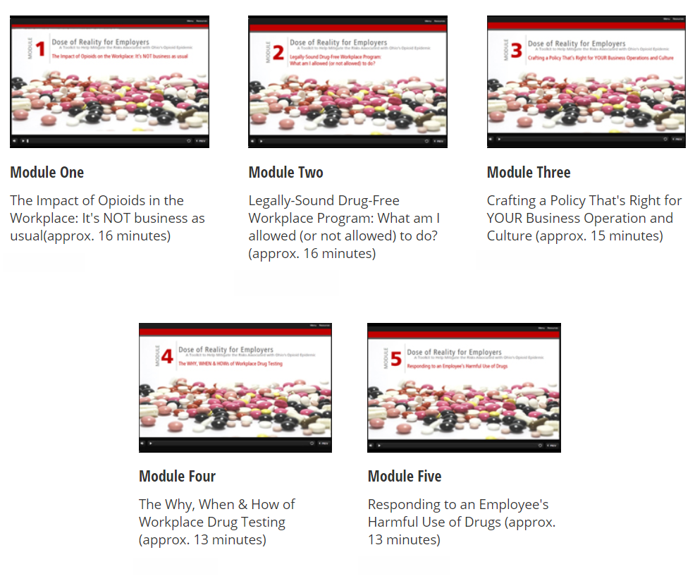
This 5-module course provided an overview of the legal and operational issues an employer must consider in dealing with an employee’s use of opioids and other substances. The modules included best practices around how, when, and why to drug test, handling a situation if the employee confesses or is using harmful substances, and much more.
- Responsibilities: Instructional Design, eLearning Development
- Target Audience: Management team members responsible for drug-free workplace initiatives that needed to create behavioral change in adults and, ultimately, improve the quality of their workforce
- Tools Used: Articulate Storyline, PowerPoint, Adobe Photoshop, Camtasia Studio
- Budget: Medium
![]()
MY DESIGN APPROACH
For the design phase of the project, I wanted to achieve three goals:
- Ensure learners can view the course on iPad Pro devices
- Create a modern design that was appealing to the learners by utilizing the basic principles of design (contrast, repetition, alignment, proximity, unity, and simplicity)
- Deliver time-sensitive information and resources that would help employers manage the risks associated with the opioid crisis facing their community
ENSURE COMPATIBILITY WITH IPADS
To ensure the course would work on the iPad Pro, I:
- Performed multiple tests to ensure graphics, navigational and interactive elements functioned and displayed as expected
- Optimized images to reduce bandwidth requirements across mobile devices
- Designed a separate tutorial that explained how to navigate the module from both a desktop and iPad perspective
- Published to HTML5 from Storyline 360 and tested across all major browser platforms
CREATE A MODERN DESIGN
A good design makes it easy for learners to learn the material and affects the perceived credibility of the content and the designer’s professionalism. To achieve this goal, I focused on and applied the six principles relevant to e-Learning: Contrast, Repetition, Alignment, Proximity, Unity, and Simplicity.
- Red, gray, and black were the three colors used in the design of the modules.
- Red conveys attention and demands action.
- Black complements red by bringing a sense of “style” to the overall visual look of the modules.
- Gray, a cool neutral color, provided a complementary accent for the design
- Throughout the modules, we emphasized keywords and ideas, using color and a variety of different font weights to create contrast
- Icons were reused throughout to create repetition and further enhance the design and clarity of information
- I selected images to not only reinforce text but to convey the key messages in the content


DELIVER TIME-SENSITIVE INFORMATION/RESOURCES
According to the National Institute on Drug Abuse, more than 115 people in the U.S. die after overdosing on opioids every day. The Centers for Disease Control (CDC) estimates that the total “economic burden” of prescription opioid misuse alone in the U.S. is $78.5 billion a year, including healthcare costs, lost productivity, addiction treatment, and criminal justice involvement.
When approached to design and deliver this course, time to market was critical. Ohio’s employers asked what they should do about the opioid problem in their workplaces. I started this project in mid-November and delivered it to the client on January 5th. A month after releasing this free resource, available to all Ohio businesses, the Opioid Toolkit received over 4,000 visitors and coverage in at least 11 news outlets!
Do you need a similar course? If so, contact me today! I would love to work with you and your team to design and deliver training that engages your employees and helps drive change within your organization.