Colors are an essential consideration in any e-Learning design. While most designs should adhere to your company’s branding guidelines, you will sometimes have the option to select colors for your course. Best practice stipulates that you stick with 2-3 colors. What colors should they be? Well, that depends upon what you want to convey to the learner.
There is an entire psychology behind colors that I won’t cover in this post, but a quick Google search should provide the information you need. Here’s a link to one that you might find helpful. The same goes for learning about tones, tints, and shades. Tones are used if the color is too intense (e.g., add white or black to the color), tints are used to convey a lighter, more peaceful feeling (e.g., add white to the pure color), and shades are created by adding black to the pure color which creates a more mysterious, dark feeling. Of course, there are monochromatic, analogous, and complementary palettes to consider too! Again, you’ll find more than enough blog posts out there to learn about all of these things but for now, let’s talk about the 2022 Pantone Color of the Year, Pantone 17-3938 Very Peri.
Each year, Articulate conducts an e-Learning challenge based on that year’s color. Here’s the one for 2021! This year’s challenge is to design an e-learning template or interaction using the Very Peri color.
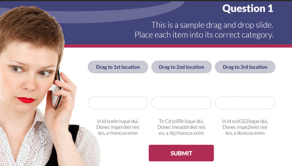
For my submission, I chose to create a mockup for a drag-and-drop interaction using Very Peri as the primary color focus and Pink Flambe’ as an accent color.
Click the image below to view my drag-and-drop sample demo!


Leave a Reply